
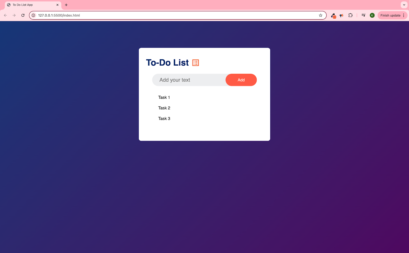
How I built this To Do List App with screenshots included.
Live version available here: To Do List App
Technologies Used:
- From this tutorial: To Do List by GreatStack
- CSS Pseudo Classes and Hover
- Google Fonts (CDN and downloaded icons with custom CSS)
- Onclick (JavaScript)
- W3Schools for enter keydown and commentary on addEventListener
- Local storage for persistent data
We’re jumping right in with CSS styling because I just love how this channel does it! I do usually start coding by setting up my file structure, links, and testing those links. So you can find more details on that in my previous post/the README on the Digital Clock Build.
Back to the CSS – I really appreciate the techniques shown in these tutorials that produce really beautiful and slick websites with just vanilla CSS. It’s really fun to comment out or alter CSS code just to see what effects each rule has on the final product. In bootcamp they had us just make up our own styling, which, no shade to them, I understand the thought process behind it, but following tutorials like this is like following a recipe with new ingredients and techniques. Even though I don’t fully understand them at first, after a few tries and playing around with it, I’m able to build a foundation of knowledge.


In the tutorial they have a link to icons and images to download, which is great, but their assets are behind a registration wall (I would have to create an account with them, which I think is free, but it’s still another step I don’t have the bandwidth for currently). Plus, I love any excuse to use Google Fonts and Materialize. It’s such a great free library available, and it usually does cover any needs, especially since the icons are customizable.
I’m just testing the functionality here, and later on I end up having to download the check icon anyway instead of using span code snippet due to dynamically changing the display via JavaScript and CSS classes.
I am really stoked on the practice of importing assets from libraries and adding custom styling via CSS. That’s what the next couple slides are showing.


The above is the end result of a bunch of debugging and experimentation where I wasn’t finding the icon size changing, even though the rule worked for the color. I ended up adding the class “list” to the check icon, and altering the CSS rule syntax to include “material-icons”. I didn’t just want to use the “material-icons” class for this because at the time I was planning on using other icons from Google Fonts, which would also share that same class. Little did I know that I couldn’t use the span tags in the later use cases, so I could have just left this as “material-icons”. Oh well, glad to have learned!

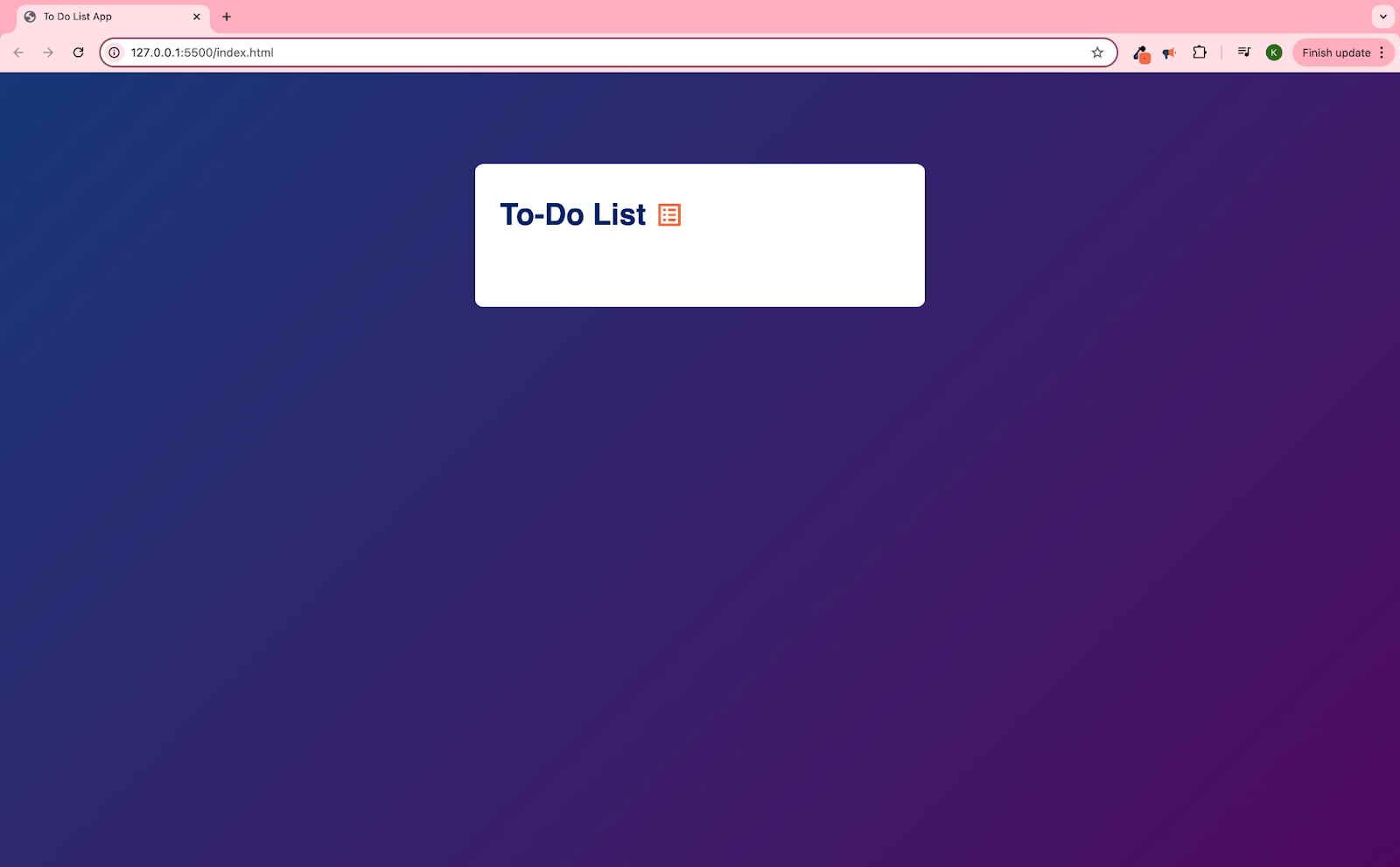
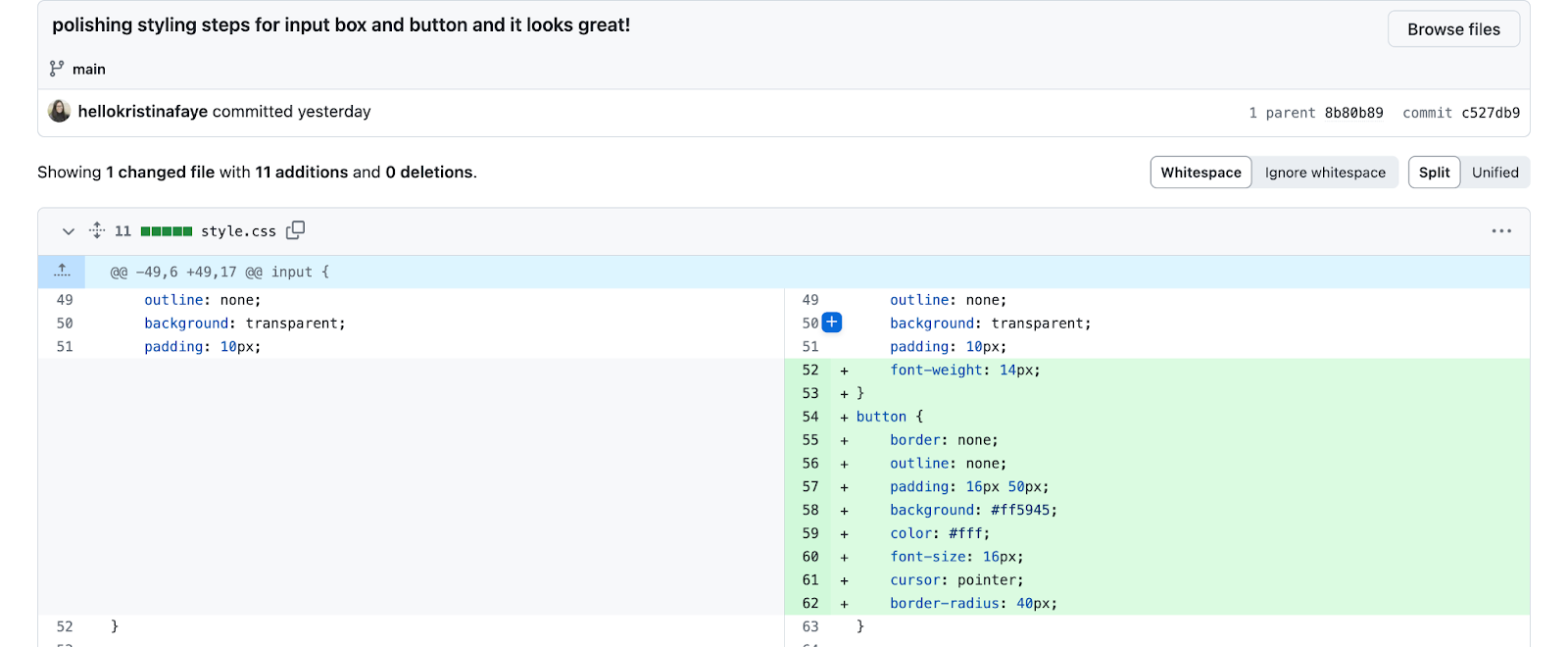
I searched Google Fonts for a list icon, and then styled it to better match the tutorial’s header.
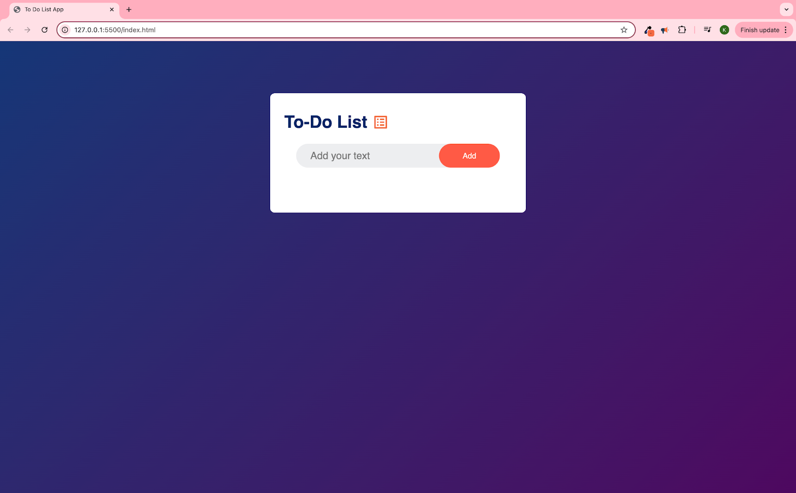
This is a great example of super simple vanilla CSS having an enormous impact on the visual quality and therefore user experience of the page. Just a few rules in CSS and the page goes from very basic Windows 98 to perfectly modern.
Again, loving this super simple vanilla CSS and its huge impact on the quality and perceived value of the page.
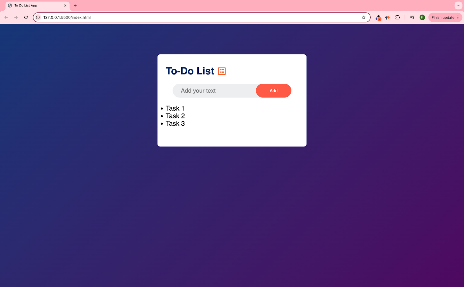
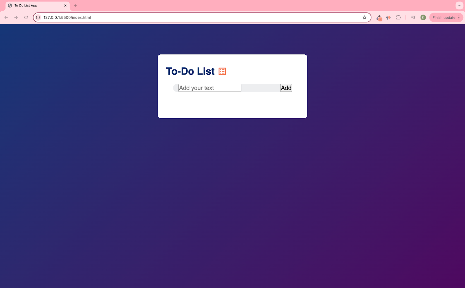
This is a great technique I’m noticing in a lot of tutorials from GreatStack and my other current favorite, Future Coders, where they add simple HTML elements to stand in for the soon to be dynamically added elements of JavaScript. That way, we can get all or nearly all of the styling done before diving into the JavaScript. Just a nice way to keep the work compartmentalized. I don’t know if this is a best practice in the workplace, but I certainly appreciate it as a learner!

This is a spot where I tried using the code snippets from Google Fonts to show the empty circle at the left side of the list. But then later in the tutorial found out that this image needs to be produced by the CSS in order for the JavaScript to successfully produce the image dynamically. So even though I ended up with the same image using the CDN and code snippets, it’s not the same practically, and I had to delete a bunch of code and back out of that plan. It was a fine learning experience! Especially getting to just back out of it, and then redirecting by downloading the necessary icons from Google Fonts anyway.


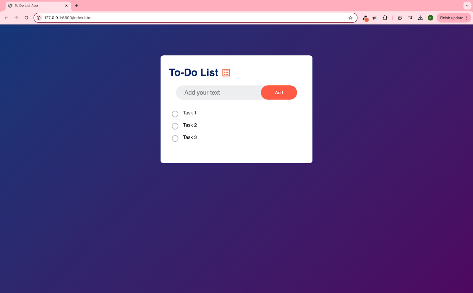
Lol oops – back to pseudo elements in CSS. Like, literally I had already scaled my snippets to the three Tasks before finding out how the CSS classes would be switched dynamically! Anyway, it’s pretty cool to learn “text-decoration: line-through” for this effect.
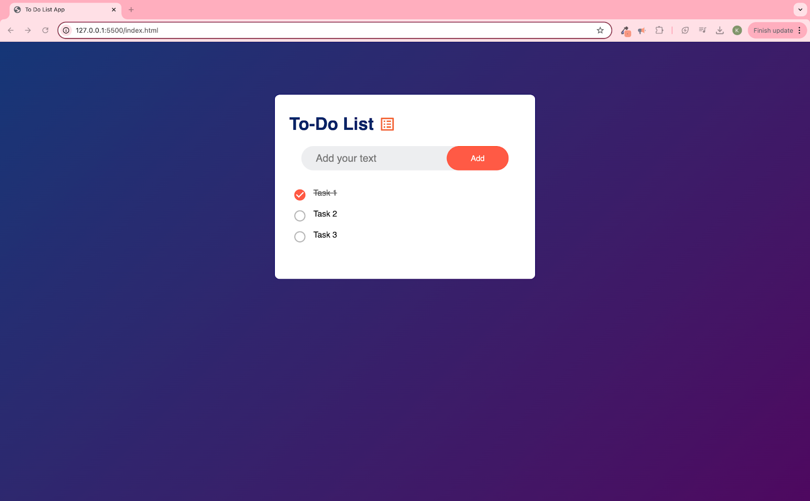

Again, loving the practics with pseudo-classes, which is how the check and circle icons are actually displayed. So the rules that start on lines 72 and 88 are what dictate how the icons show up in each list item.

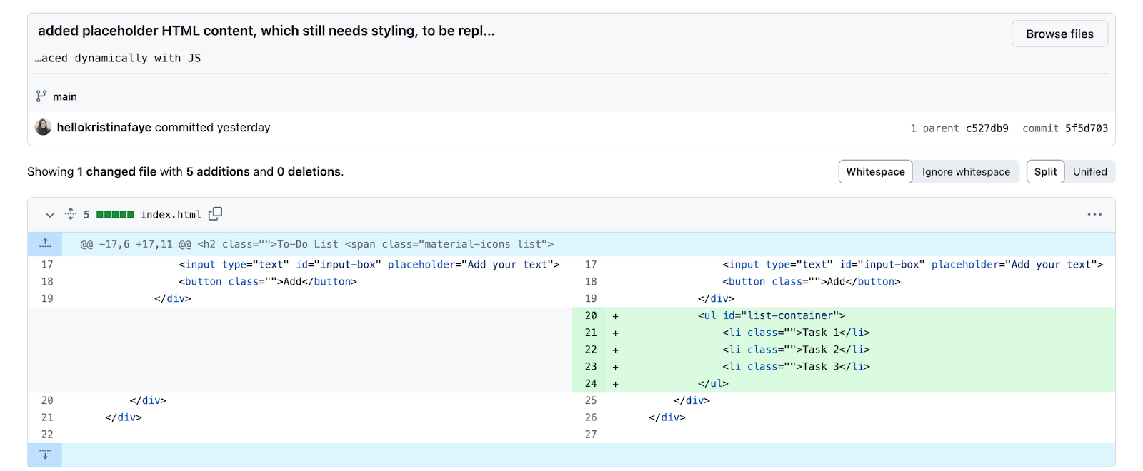
Cleared placeholder HTML content to go on JS! Actually it’s just commented out.

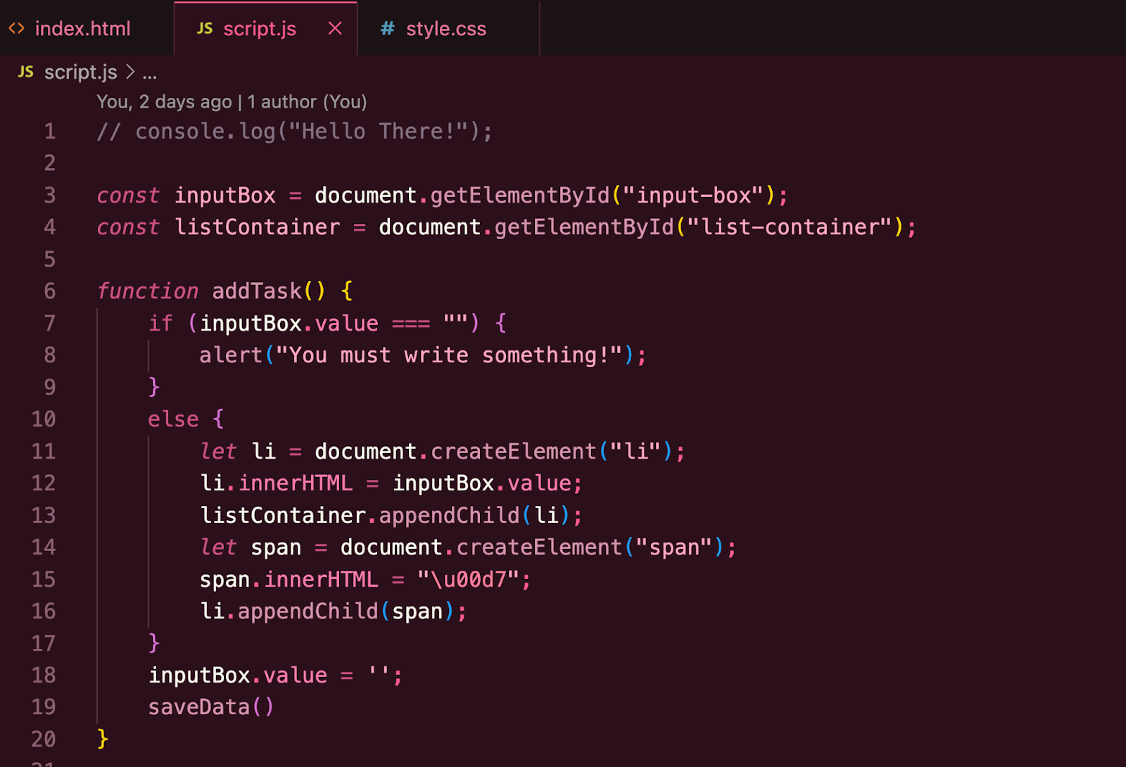
And here’s the actual finished code for addTask(), which is called in the HTML as an onclick. I like how the first condition is the edge case. In bootcamp my teacher emphasized that that’s the best practice, and it’s cool seeing that in other learning sources. I’ve seen it a few times now in if-else statements out there, to the point that it kind of feels like the default use of the first condition.
I couldn’t quite find the commit for the older version, but the first test of this function’s, um, functionality(?) was before lines 14-19 were written. So it was just to create the “li” element, and then append it to the listContainer. Honestly at that point I did want to do a functionality check with like, a console.log but it didn’t work?? I’m not sure why not and at this point I think the code has gone too far for me to check it. I mean, it works, but internally I want that validation before I move on to display code. That’s a tough part about JavaScript because so much of it is invisible. Like, it’s designed to work behind the scenes so you have to actively create places to peek at the results.
Oh wait now I remember – there was a TYPO on line 11, now that I think about it. And that’s why it wasn’t displaying, prompting me to wish there was a console.log solution available. And then I did a console.log, and that’s how I knew to dig a bit deeper into the code for an issue.
The word document was misspelled and VSC didn’t tell me!!! Shouldn’t it tell you? Like, document is a keyword, I feel like VSC should have told me that it was misspelled. LIke, GDOCs tells me when stuff is misspelled with a little red underline! Maybe there’s a setting in VSC that I can turn on to tell me. That would really help with debugging as it would automatically catch at least some typos.
Anyway, then we repeated the create/append process with a span so the list item includes a close button. But the following screenshots were tests of appending the “li” BEFORE we added the span, so it doesn’t show up until a few slides later.


Haha, included this because that tiny adjustment did make a difference, at least in terms of matching the tutorial. I’m sure what he did is the better practice so I want to follow his results to the best of my ability. It’s just a little different because I was using the Google Font icon I downloaded instead of his.

It’s so cool that this one line (15) clears the input box. Like, such a great move! It adds a necessary bit of functionality with just the one line. (omg I’m using the word “functionality” too much! Will hopefully find a synonym soon lol).

And here we are finally adding the span for the close button! I bet there are many ways to do this, but this is pretty cool to just include the createElement and appendChild in the function itself.

Shows hover
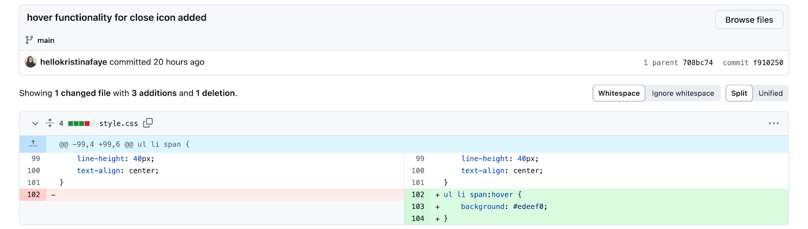
Loving the use of pseudo-classes here for the hover. Really opens up a huge swath of CSS functionality.

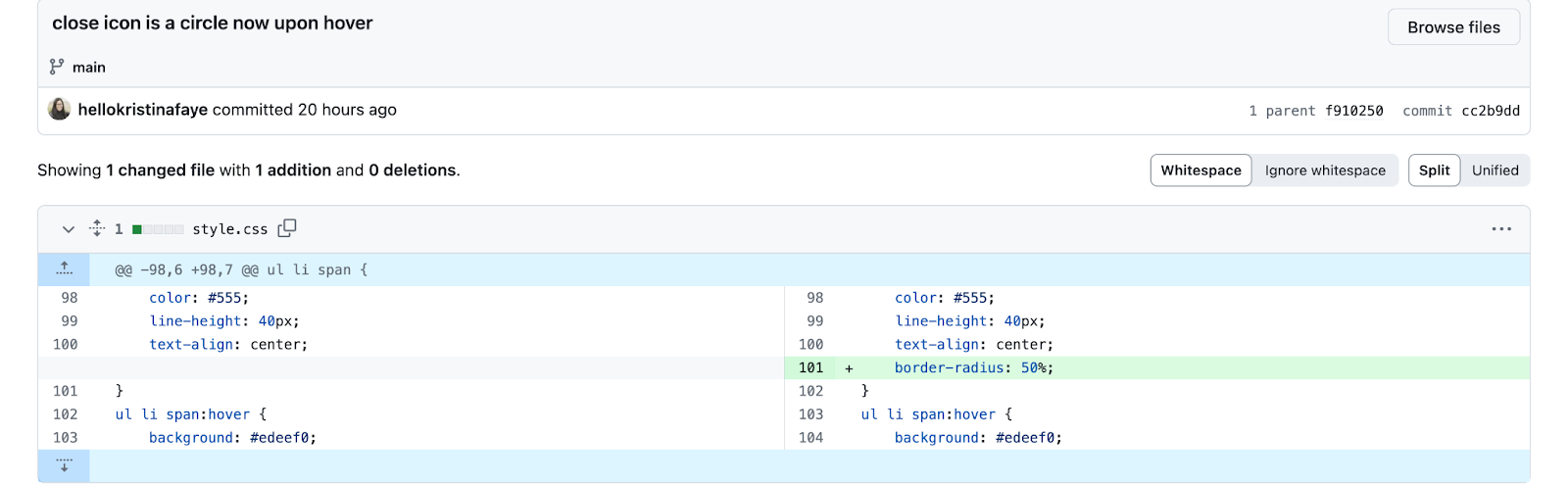
And then our bestie border-radius: 50%; to make stuff circles! Again, I just want to admire how the simplest little code snippets create elements that are slick and really elevate the website look and feel. It’s like how salt just brings dishes to life, or a squeeze of lemon juice.


Ok this one is actually REALLY cool. This function controls what happens when you click in certain spots. Like, THIS is how it knows what to do AND what spots on the page are significant. Let’s maybe really internalize this connection, b/c this feels significant.
Well, this plus all the tag names, the classes and rules in CSS. This is like, the switch. The HTML and CSS are like, the hardware, and this is like the on-off or some other ruling body. And it’s conditional statement. Like, this is a use-case for if/else statements!
The .toggle() method is pretty cool too! It just turns that class on or off (adds it to the class list of the LI element. So cool!
So the HTML tags are how javascript can select things to manipulate. Change dynamically. This is why its so cool.
And I think CSS is why it looks cool, or how it can look cool. Like, if there was no CSS, those effects wouldn’t exist. WTF in bootcamp they were like, minimizing its importance. I guess?? But they could have explained the role CSS plays even when you’re mainly using JavaScript. Like no, you really need your HTML and CSS game strong when coding for the best in JavaScript.
And about 25-27:
That’s how it selects the span tag that’s the close button! Yeah I think this is the close button code, like boilerplate. It’s so cool, what a beautiful phrase. I guess in this case that’s the edge case, but I do think it would be best at the end. Maybe this is a good code template for all button functions? How does it fit in that? OH yeah I guess I know how to use buttons to link to other pages, but for the ones that DO something on the page like change the day/night mode or calculate something, JavaScript like this is what’s gonna do it.
About .addEventListenter():
Very cool method, I bet we’ll spend a lot of time with this one. So from W3Schools the syntax is:
- element.addEventListener(event, function, useCapture);
- The first parameter is the type of the event (like “click” or “mousedown” or any other HTML DOM Event.)
- The second parameter is the function we want to call when the event occurs.
- The third parameter is a boolean value specifying whether to use event bubbling or event capturing. This parameter is optional.

Ok this bit is exactly what I was talking about when the value of JavaScript being hard to see. The function at this point works, but doesn’t display anything in the browser. This is where you would use a console.log to check the result. But in this case you would need to walk the dom to access the local storage. I’m not sure if that’s how you say it, but I mean when you go to local storage and get the data. Lol, which, I think I was imagining something else, but then got to the next bit in the tutorial lol.
Calling saveData at the required spots in the function was pretty cool. Like, this is when you wanna add one to refresh localStorage and the display.

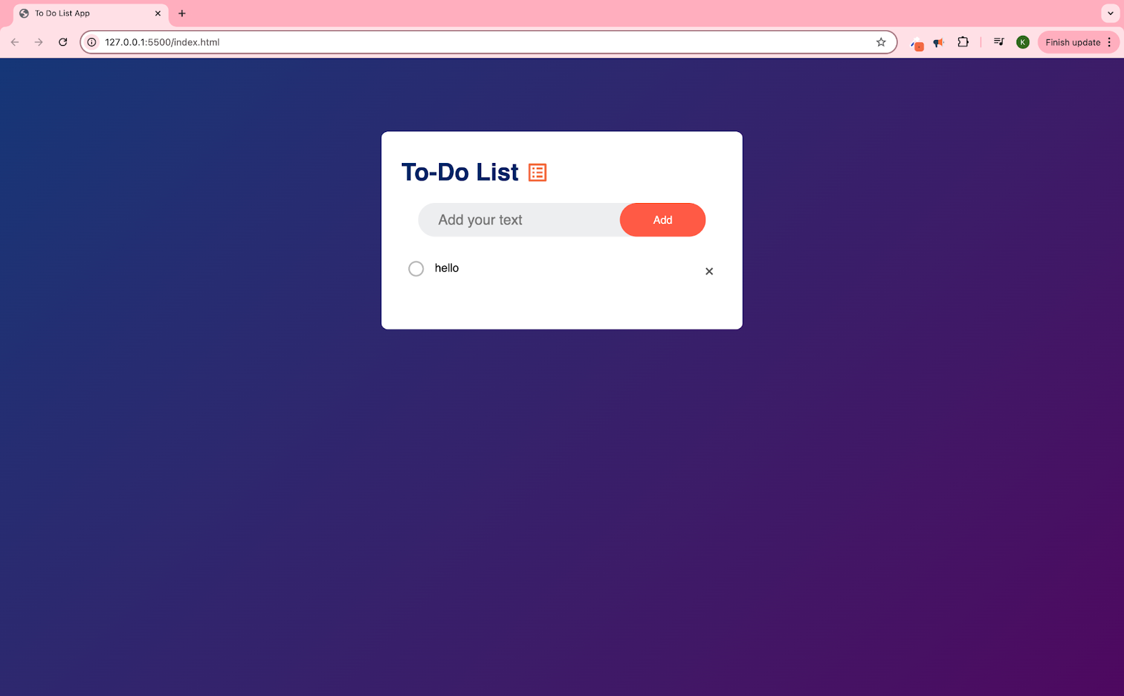
As noted, it’s hard to display the power of this code in stills, like there would be SO many screenshots. So I’m just gonna re-link the live To Do List App here and suggest you try it!

For my Keyboard Warriors! Had to make the return key work for submitting an entry. Literally I appreciate this code so much! I’m sure there’s a way to make this the default, and I would love to commit it to memory, but also just noting that it exists as boilerplate is pretty cool. I had to update the class on the input box so it matched this code. Which is directly from W3Schools, including the comments. I really like comments like this – I just read on Javascript.info that these aren’t good, maybe they mean in a workplace, but I personally really like these. I guess because good devs won’t need the translation, they can just read the code itself, but hey I’m a beginner. Anyway I grabbed this from w3schools which is one of my favorite resources in tandem with Javascript.info. These are like my go to sites when I have a question. I’m just reading through JavaScript.info as part of my learning journey too!
Future Dev:
- Draggability
- Updating list icon to something cuter
- Basically rebuilding Google Keep
- So the tab/grouping function.
- Access from multiple devices
Leave a Reply